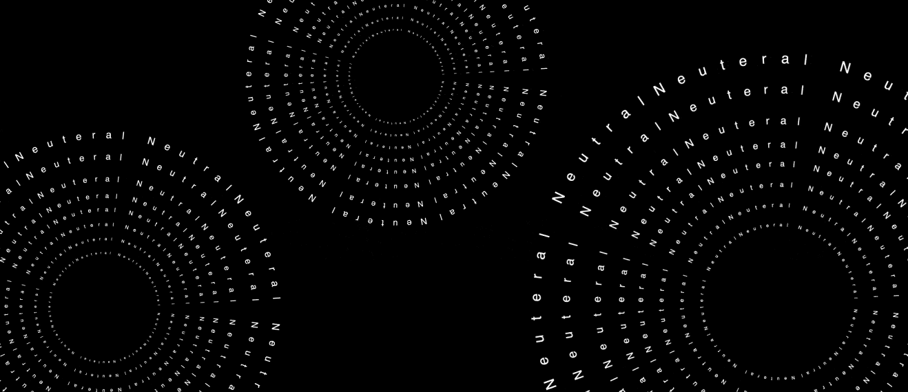
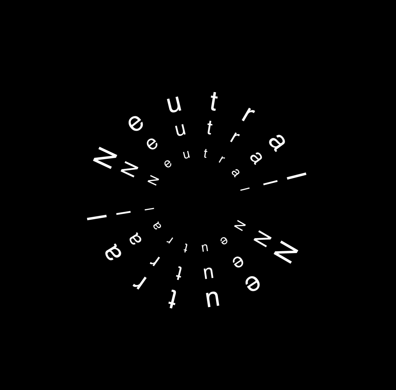
Exhibition project exploring Helvetica through a series of typographic exercises that examine its structure, versatility, and visual impact. Through research and experimentation, the process focused on understanding what makes the typeface compelling, with an emphasis on kerning, page layout, and type anatomy. These studies culminated in a large-format poster, showcasing a refined understanding of Helvetica’s nuances and design potential.